


Expert Advice: How to pick the perfect neutral paint colour for your home
By Amanda Kavanagh
19th Feb 2024
19th Feb 2024

Picking neutral paint is notoriously difficult. We ask four influential designers for their advice in pulling off calm hues, with (gentle) panache.
Anyone who has applied a crisp, gallery white to their walls, only for it to glow purple upon drying, will know how challenging it is to pick the right neutral paint.
Choosing from a colour card or copying a magazine spread will not work. Every home has different light, different floors, different greenery outside, and each room has a different aspect, all of which can affect how colours present themselves.
White is the most difficult, as most are pigmented with different undertones, from reds to blues and greens, so picking the perfect paint is tricky – but help is at hand.
Maria MacVeigh, interior designer and registered architect
Why is choosing neutral paints so difficult?
The differences between the neutrals are quite subtle making it difficult to see which you like, you need to paint a good sample of a neutral colour to see it in different parts of your house, as it will change in different rooms and different light.
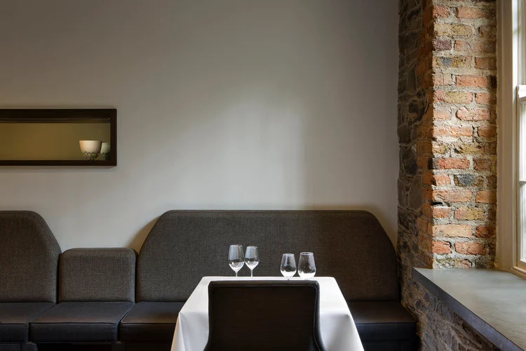
Maria McVeigh’s Cowper project // Photograph: Barbara Corisco
Where should people begin?
With brands they trust, well laid-out colour cards, and advice from good suppliers like MRCB, Stillorgan Décor and Pat McDonnell in Cork. Most large paint suppliers will have a dedicated person for advice.
What should we look out for?
Look on colour cards to see the source of the colour. The neutrals tend to be placed in line with the dominant colour, at the top of the card, that will indicate the direction you are going in. Our climate prefers warm neutrals to cool neutrals.
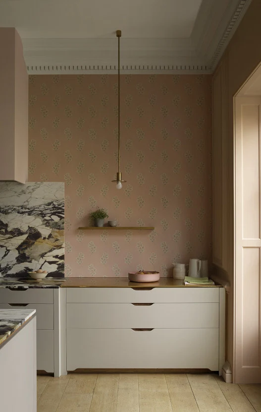
Maria MacVeigh, Chapter One // Photograph: Barbara Corsico
Common mistakes?
Too many combinations of neutrals and colours, and neutrals which are not neutral enough, rendering the finish neither bold nor crisp.
Any hues you particularly love at the moment?
Colourtrend Milk Teeth, for walls and ceilings, is very fresh. As a subtle contrast, paint woodwork in plain white eggshell finish, from any brand.
Olha Kelly, chromologist and colour consultant with MRCB
Why is choosing neutral paints so difficult?
In a professional colour palette, there are thousands of neutral shades and yet they are all different with different undertones. I would advise my clients to think about colour rather as a background.
Samples of materials and light have to be taken into consideration before choosing any colour. Neutral is really any soft light to medium depth colour that will provide a uniform balanced background to flooring, furniture, art and soft furnishing. It can vary from off-whites to greys and beiges.
Where should people begin?
The selection of paint colour should be left to the final stage of planning. Concentrate on and choose your main materials first; fixtures, flooring, tiles, carpets, worktops and so on. Seek professional advice from colour consultants and have physical samples of your main materials to hand. Then, select and test in situ. This is the only way to be able to see the reality of the chosen colour.
If you haven’t lived in the house before or did not choose main materials/concept then I would recommend at least 6 months minimum to wait, but preferably a year. This way it’s possible to see the light through seasons but most importantly, to know the flow and use of the space. I recommend painting everything in any white – if it has to be painted – and wait a year.
All colours, except whites, should be tested on large sheets of lining paper never directly on the walls. At least 2 to 3m to get a good idea of colour. You can then move them around the room.
What should we look out for?
Research paint brands and quality. Work out your quantities and budget. Keep in mind that with the overall colour palette, it is important to maintain the flow throughout the house. It is easy to be overwhelmed with a choice of colours so my advice is always to eliminate and narrow down to only two or three options.
Common mistakes?
People selecting a paint colour too early on in their project, plus not testing and selecting in situ leads to wrong decisions. Never select a paint colour from a photograph or screen image, this serves as a guide only, and a paint colour that works in someone else’s home does not mean it is the right one for yours.
Paint and Paper Library’s Temple seen on shutters
Any hues you particularly love at the moment?
This might sound strange to most but, in my opinion, the most perfect neutral is a soft stony pink like Desert Rose or Temple from Paint and Paper Library. They work as a good background to most of colours, especially if clients were not able to obtain samples of materials and perhaps haven’t chosen any furniture yet. I am trying to avoid white in Ireland as I don’t think it works well in our light and can be a bit harsh.
Gregory Curran, interior designer
Why is choosing neutral paints so difficult?
Because they often appear cold and boring – white in particular can appear very cold and clinical. It works well in countries like Italy, Greece and Spain because of their beautiful sunshine and light. Unfortunately, although we have lovely light here in Ireland, it lacks the depth and warmth you get in those warmer countries. Our light is cooler.
Little Greene’s Grey Collection has 28 shades. Here, the back wall is Grey Teal, the wall to the right is Inox, and Shallows is on the floor.
Where should people begin?
When choosing a neutral colour I would advise avoiding pure white altogether, except for ceilings. Also, avoid anything that has a yellow base, these often appear sickly, and under no circumstances use magnolia. It is not the safe option.
Natural light is very important when choosing a colour. A colour that works well in a sunny, bright, room can appear cold and bland in a room that does not get a lot of natural light. Often stronger colours work better in darker rooms as they add interest and depth, whereas a pale colour can just look cold.
What should we look out for?
Look for a neutral colour that has some depth, often one with more of a warm grey or taupe base.
Common mistakes?
Using white as the safe, easy option.
Shallows by Little Greene, seen on wall
Do you have any hues from any brands that you particularly love at the moment?
I like the Grey collection from Little Greene Paints, their Ceviche and Shallows are great colours. Also, Shell Cove from Colourtrend’s Historic Collection and Dimity by Farrow & Ball are colours I have used in the past on period homes.
For woodwork, I often use Milk Teeth, also from the Historic Collection by Colourtrend, in a satinwood finish. RAL 1013 is also a good colour to use on woodwork, particularly period houses.
Gillian Sherrard, interior designer
Why is choosing neutral paints so difficult?
Choosing neutral or white paint is difficult because it sets the tone and theme for the whole residence. It is usually not just chosen for only one room, but is carried throughout the house and used as a backdrop for your chosen pop of colour. Paint and paying a decorator is an expensive business so getting it right is important. There are so many paint brands on the market that it’s easy to become bamboozled with the vast variety that is on offer.
Strong White by Farrow & Ball in Gillian’s own home // Photograph: Mark Scott
Where should people begin?
I carry a swatch of colours around with me and I am constantly matching it to interiors when I am out and about. Before Covid-19, I would hold my colour chart up against walls of restaurants and friends’ houses. I holiday a lot in the summer in the South of France where the light is vivid and over the years I have discovered beautiful palettes of colour.
Dulux do a large sample palette book which I find invaluable and I carry it in my handbag and briefcase. It’s important to hold the colour card up to the wall or surface, and you will find 100% of the time that it isn’t the colour you thought it was.
Pointing by Farrow & Ball in Gillian Sherrard’s Glenageary project // Photograph: Al Higgins // Styling: Ciara O’Donovan
What should we look out for?
My advice is never choose a colour directly from a swatch card unless you have actually seen the colour on a large wall. The colours on the swatches are deceiving and I am sure everyone has experienced the feeling of “that’s not the colour I thought it was!”
Avoid putting lots of samples on the wall because the colours look different on different walls according to the fall of light. It becomes a confusing and expensive process to buy lots of sample tins.
If your space is small, I tend to simply go for a pure white to give a crisp architectural spacious feel. There is no doubt that a white colour palette makes a space feel larger than it actually is. Larger spaces can take an off-white shade.
Remember that the orientation of your home will determine your choice of colour palette. North-facing properties will have to be applied with brighter off-whites than south facing.
Common mistakes?
Using different shades of white in different rooms. I tend to stick to one off-white colour and use it throughout the property to create consistency and uniformity. Always write down your colour specification. A common mistake is when people go to redecorate and they have forgotten the colour they choose five years ago and waste time trying to match up.
The decorator should have a written list to avoid any confusion. Many times I have gone on site and ceilings or walls are the wrong colour. It is vital that everyone is singing off the same hymn sheet. The colour specification is to be referred to at all times and sometimes I even get the decorator to sign it.
Also, check the manufacturer’s paint tins. Sometimes the decorators match your colour with a cheaper brand. I am always looking at cans of paint on-site and checking labels.
A common sense tip is to make sure the paint is in stock. If you decide to go for an environmentally-friendly paint, make sure the decorator has supplies on time, otherwise, a project can be delayed.
Any hues you particularly love at the moment?
Farrow & Ball have great hues and I tend to use Ammonite, a relatively new colour a lot along with Strong White. For a more traditional off-white, I use Pointing, which has a slightly creamy tone.
I like to support Irish businesses so I tend to match these colours with the Colourtrend brand whose paints are manufactured in Celbridge, and the decorators tell me they have a smoother coverage and are easier to apply. Colourtrend has just launched a new range called Curator and I found Set In Stone to be a good base colour.
I am also using Mylands Paints, who have an interesting range of off-whites including Cotton Street and on a recent trip to France, some persistent questioning allowed me to discover Pure & Original, a lime-based paint manufacturer based in Belgium with a terrific range of colours. Sea Foam is a stunning colour.
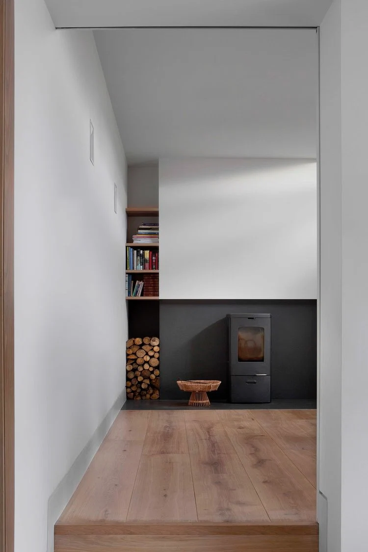
Featured image: A beautifully restored piano nobile in Glenageary by designer Maria MacVeigh
Photograph: Mark Scott. This article was originally published in June 2022.
Related Stories


Also Read


