


4 things to consider before choosing paint for your room, according to the experts
By Megan Burns
10th Sep 2024
10th Sep 2024

Colour is a powerful starting point in creating a mood in your room – we lay out how to achieve your desired effect.
Every room needs a refresh once in a while, and painting the walls is one of the easiest ways to do so. But pulling out a colour card can seem like a menu of endless options, and it’s not always clear which one you should choose. Which neutral will make your kitchen feel chic rather than cold, and which of the dozen shades of white is best?
Testing a colour in situ will always give you a final idea of whether it’s right or not, but before you get to that stage, there’s other things to keep in mind that can help narrow your decision down.
Light
A key aspect that is rarely taken into consideration is the light that comes with the Irish climate. Denise O’Connor of Optimise Design has plenty of experience choosing colours for Irish homes, and has even written an eBook on the subject. She explains that “Ireland gets a large number of cloudy days throughout the year, which makes the light soft and diffused. Many homes also have darker, north-facing rooms or are light-starved at certain times of the year.”
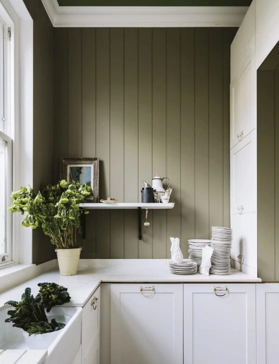
It’s therefore important to identify exactly what kind of light you are working with. Sunny, south-facing rooms can generally take a wider range of shades, as the light they receive is warmer and more plentiful. If your room lacks light, or is north-facing, it can feel colder. Denise advises that “A common mistake with dark rooms is to paint them white to brighten them, but this will make them feel clinical. With north-facing rooms you should try to make them feel cosy, so warm earthy shades work best.” You can also lean into the lack of light by choosing a dark shade, which will make the room feel snug.
Existing features
Existing features of your room also need to be considered. This can include everything from the floor to the window frames. It goes without saying that if you’re not buying new items like rugs or sofas, that the colours you choose will need to work with them. However, a piece you love can actually provide a starting point for your colour palette. Whether you go for a grey with green undertones to go with a green sofa, or take the colours from a favourite artwork for your scheme, this will make a room feel very cohesive.
Consider also adjoining rooms, and their dominant shades. Clashing colours when you move from one space to the next will feel jarring. Denise recommends creating swatches for each room and putting them together to see how they look.
Complementary colours
To create a nuanced scheme, don’t default to painting details like ceilings and woodwork white. As interior designer Roisin Lafferty points out, “Neutrals can be achieved by selecting a colour with very little saturation in it. Soft greens, blues, and even pinks can work as a neutral. The key is to avoid anything with a bright or yellowish base tone. Mahogany Rose from Fleetwood is my fail safe neutral. It creates calming yet bright spaces and works wonderfully with rich timber floors.”
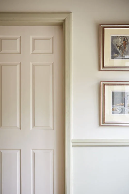
If you’re unsure, Denise recommends using a lighter shade of your wall colour on ceilings and woodwork, and a darker shade of it for any feature areas. Using different tones of the same colour is also a subtle way to break up an open plan space.
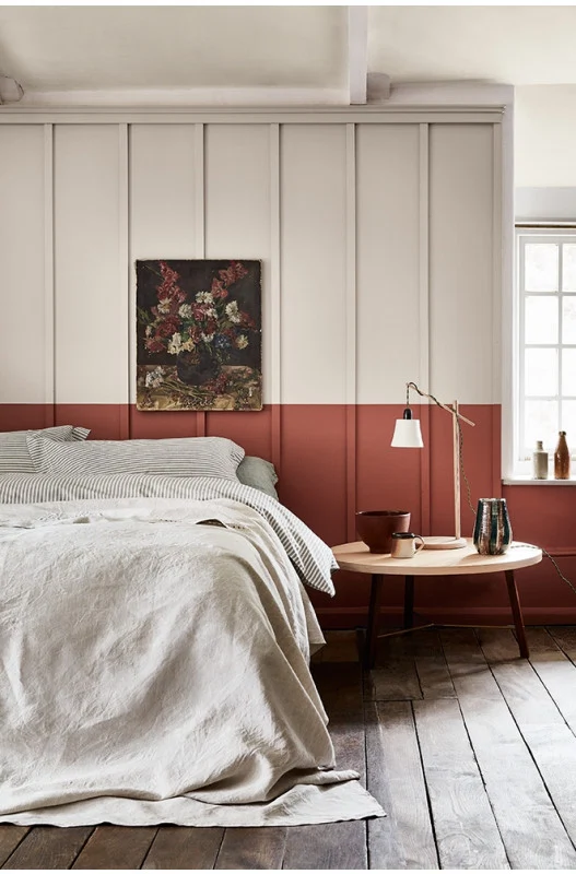
The undertones of your chosen neutral will also have an impact. A neutral with complementary (in other words, the opposite side of the colour wheel) undertones to your chosen colour will provide contrast, while one with similar undertones will be calming to the eye. Patrick O’Donnell, Brand Ambassador for Farrow & Ball, advises that if your room has low ceilings, use a neutral in a similar tone to the wall colour for them, or even use the same colour. “Your eye won’t be drawn to the point where your wall and ceiling meet, giving a greater sense of height.” He also points out that you need not always choose a paler colour. “Dark skirtings and architraves frame the largest surface area, giving the illusion of more space.”
Ingredients
Lastly, once you have narrowed down the shade you want to use, it’s worth investigating the options that are out there when it comes to your paint ingredients. Virtually every paint will release Volatile Organic Compounds (VOCs) into the air once applied, for up to five years. Levels vary greatly, and these have been shown to cause skin irritation, nose and throat discomfort, headaches and allergic reactions, so it’s worth checking the levels of the paint you’re considering.
If you want a more eco-friendly choice or are particularly concerned about VOCs, you can opt for natural paint that isn’t made from petrochemicals. They are usually made from things like plant dyes, clay, and chalk, while some newer formulations make use of byproducts from biomass energy. They will still release VOCs but in much smaller quantities. Director of Edward Bulmer Paints, Emma Bulmer also explains that “The production of natural paint does not produce any toxic waste. You could even put unused natural paint on the compost.”
There is a much greater range of these paints available than before, and the paint is of a high quality. Earthborn, Ralston and Earthpaint are available from Pat McDonnell Paints, while brands including Lakeland and Edward Bulmer will deliver to Ireland. There is no one definition of environmentally-friendly paint, so it’s important to decide what your priorities are, and research the different brands available.
This article was originally published in 2023.
Related Stories


Also Read


