


Sponsored
Meet the architect who has most likely inspired your entire home decor
Sponsored By
By Eva Hall
19th Nov 2019
19th Nov 2019
Sponsored By

You know those neutral shades you’ve based every room in your home around? Chances are Denise O’Connor inspired that decision. Here, the architect and managing director of Optimise Design, advises us on how to use the revolutionary Dulux Signature Collection.
Most of us jump into designing our homes paint first, and furniture later. The excitement of designing your own space is palpable, and there are interiors magazines and mood boards strewn all over the house. But just a few weeks in, what seemed like a passion project has become a pain in the neck, and all you want to do is get it finished.
Sound familiar?
It doesn’t have to be this way! Architect Denise O’Connor has created a colour spectrum to take the hassle out of designing your home, and make it fun again.

Denise first designed the Dulux Signature Collection in 2013, and it’s been revamped with the modern homeowner in mind for 2019. “At the time my task was to select the colours but also to look at how the colours were laid out,” she tells IMAGE.ie.
“When I started researching, I visited every single paint shop I could, and what struck me was the way that the colours were displayed was really confusing. You had colours on a spectrum, yellow to green, to red – there was a rainbow – and all the yellows were grouped together, and all the reds, so the colours didn’t complement each other.
“It made it really difficult to pick the right shade because you were faced with so many different versions.”
Denise created the concept of grouping colours in a way that helped the average homeowner create their own palette.
“I came up with the trios concept – three colours that work together,” she explains.
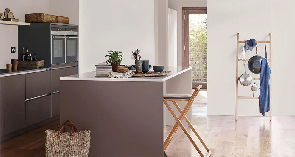
On the Signature Collection, each colour has a selection of three shades, so the colour ‘Birch’ comes in three shades of Pure, Mid or Subtle, as does ‘Cloud’, ‘Fallow’, ‘Husk’ and so on.
“That could be your whole scheme – your feature wall, wall colour and woodwork colour all in one,” says Denise. “I made sure those trios were laid out next to another trio that would complement them. That made it easier for people to see a colour that they like, but also help them coordinate their whole house.
“So for example, if there were three greys together, they might put them next to three really nice pinks, all colours that complemented each other put next to each other. The idea was to start empowering people to work with colour, and not be afraid to pick colour.”
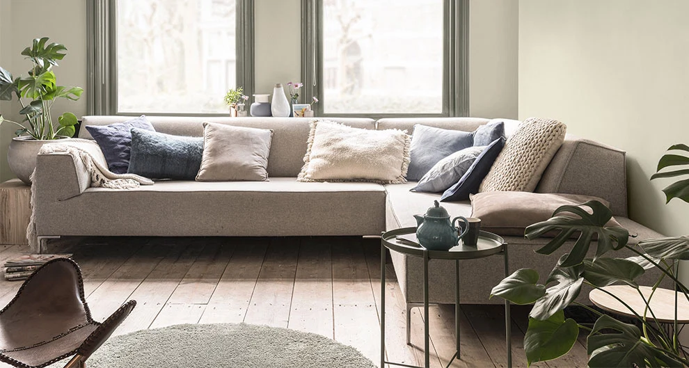
Denise says as a nation, we are “terrified” of picking the wrong shade, and tend to steer towards neutrals when it comes to designing our own homes.
“I go to people’s houses and I’ll see 10 or 15 different colour swatches on the wall, and that’s nearly worse than starting with one, because the more you put up there, the more confused you’re going to get,” she says.
“The trick is to limit decisions. When we were laying out the colour stand we put together what we called the ‘accent colours’ and they’re the really bright, vibrant, bold, brave colours, but it was more of a composition to attract the eye to make people notice.
“I have a friend who has a furniture store who tells me if they put an orange couch in the window, they’ll get more customers through the door, but nobody buys the orange couch. They all buy the neutrals.
“We’re very attracted to colour, but when it comes to living with colour, I’d say we tend to play it a little bit safer.”

However, it’s a bit different if we’re designing a room that doesn’t get used all the time, Denise, pictured, says. “Where you’re not going to see it all the time, people are a bit braver. A lot of people go for really brave colours in their guest WC, for example.”
What advice does a colour expert, architect and interior designer have for the average homeowner looking to design their house?
You guessed it… ask the experts!
“I would always suggest definitely ask for advice,” she says.
“The biggest mistake I see is choosing colours that don’t work with Irish light. The light that’s here in Ireland isn’t a very vivid light, it’s quite a mellow light.
“A common mistake I see is people painting what they think is a dark room a yellow, and it just looks awful. It isn’t going to make it feel brighter, it just makes it feel clinical. It’s not very easy to live with.
“The other mistake is going for colours with pink or peachy undertones. They’re not great with Irish light, they can be hard to pair other colours with. Or painting a dark room white – it’s going to feel really clinical – so actually what you want to do is go for cosy, if the room is dark, go with that and just make it feel a bit cosier. More cocoon-like.”
Stores that stock the Dulux Signature Collection also have colour consultants on hand to help with any queries.
Denise advises taking home samples and trying them on the surface you think you want to apply that colour to. “It’s only through using colours and experimenting and seeing how they react in different lights and different surfaces that you’ll understand what works and what doesn’t work.”
The Dulux Signature Collection is available in stores nationwide now. For colour and interiors inspiration, see here.


Also Read


