


Blurring the indoor and outdoor was key to this Victorian terraced home in Glenageary
A sunken extension that wraps around a courtyard and a corner that opens up completely create a calm, immersive mood.
A terraced home in a cul-de-sac of late Victorian houses in Glenageary, the owners of this home wanted to reimagine it as a bright, grounded space that engaged with its surroundings, and could evolve with their family.
As John Nolan of Sketch architects puts it, the aim was for the space to be, “a warm, calm and timeless home that prioritised natural light, spatial clarity, and a strong connection to the garden. Functionality was key – they wanted storage, utility, and circulation to be resolved quietly in the background”. The home had appealing original features such as deep bay windows, marble fireplaces, and decorative cornicing, but as John explains the layout lacked flow.
“Rooms were largely cellular and disconnected, with little sense of sequence or spatial clarity. Circulation zones, particularly the hallway and stairwell, were dark and compressed, acting as narrow corridors rather than spatial moments. Over time, the rear of the house had been extended in a piecemeal way, resulting in a patchwork plan that failed to connect spaces meaningfully or engage with the garden. The kitchen-breakfast room and small utility opened onto a raised patio, but this threshold felt abrupt, and the garden — sitting at a higher level — was visually and physically disconnected. Overall, the house was presentable and well-maintained, but lacked coherence, natural light in key areas, and a meaningful relationship between inside and out.”
As a result, the design approach was one of simplifying – opening up the space and prioritising light and a connection to the garden. “They wanted their garden to be an active part of the house,” John explains, “not just a view but something they were immersed in.”
This was achieved thanks to a renovation of the original house, and a new, sunken extension. In the original house, natural light was added thanks to rooflight shafts inserted into the hipped roof to brighten the hallway and stairs, while the new layout is a clear sequence of spaces, moving from restored historic rooms into a brighter, more open extension.
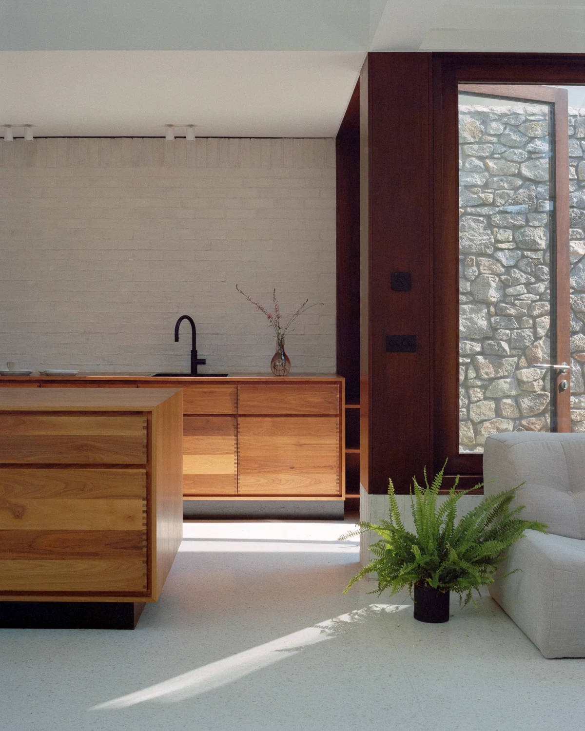
Key to this transition, John says, was a zone between the old and new spaces. “A walnut-lined ‘compression zone’ houses the WC, storage, and utility – a darker, tactile pause before the extension unfolds.”
Moving into the sunken extension, you’re met with a soft, bright space. The choice was made to lower the level of this space for several reasons, including the ability to create generous ceiling heights in this space, while keeping the existing level of the garden.
The play of light, and the blurring of the inside and outside, was delicately balanced through the design of this space. “A roof structure, divided into two distinct roof lights was introduced: a deep light scoop catching eastern morning light over the kitchen, and a horizontal roof light over ceiling joists, above the dining area to extend light into the later day,” John explains.
“The layout wraps around a courtyard – an essential light source and visual anchor for the new and existing rooms. Large corner-opening doors fold back at right angles, bringing the garden directly into the house and allowing the planting to surround the internal spaces.”
The thresholds to the garden were similarly considered, with doors that open at right angles to create framed views and allow the garden to fold into the house, while planting brought right up to the house helps soften the transition between the two spaces.
When selecting materials for this serene space, it was important that they reinforced the simple, calm atmosphere. “The palette was deliberately restrained,” John points out. “White handmade brick, pale terrazzo flooring, and walnut joinery are all minimal and enduring, while white terrazzo extends throughout the new ground floor zones, offering visual consistency and a sense of lightness.”
This deliberately restrained approach allows you to focus on the play of light and the planting to become a focus, reinforcing the indoor-outdoor feel. “Materials were chosen for how they would age: tactile, matte, and quiet rather than glossy or precious,” John says. “No element is overly polished – it’s a house designed to settle and age, to feel better over time, not more brittle.”
How these elements come together to create an immersive space is, John feels, a testament to its success. “The relationship between light and sequence – moving from the darker, walnut-lined compression zone into the open courtyard-facing spaces gives a genuine feeling of release, from quiet, historic rooms through a dark walnut- lined threshold and into a light-filled extension framed by the garden. It’s a house designed to be lived in slowly – there’s no showpiece, just carefully layered spaces that unfold across the day.”
Photography: Aisling McCoy


Also Read