By Kate Phelan
19th Aug 2015
19th Aug 2015
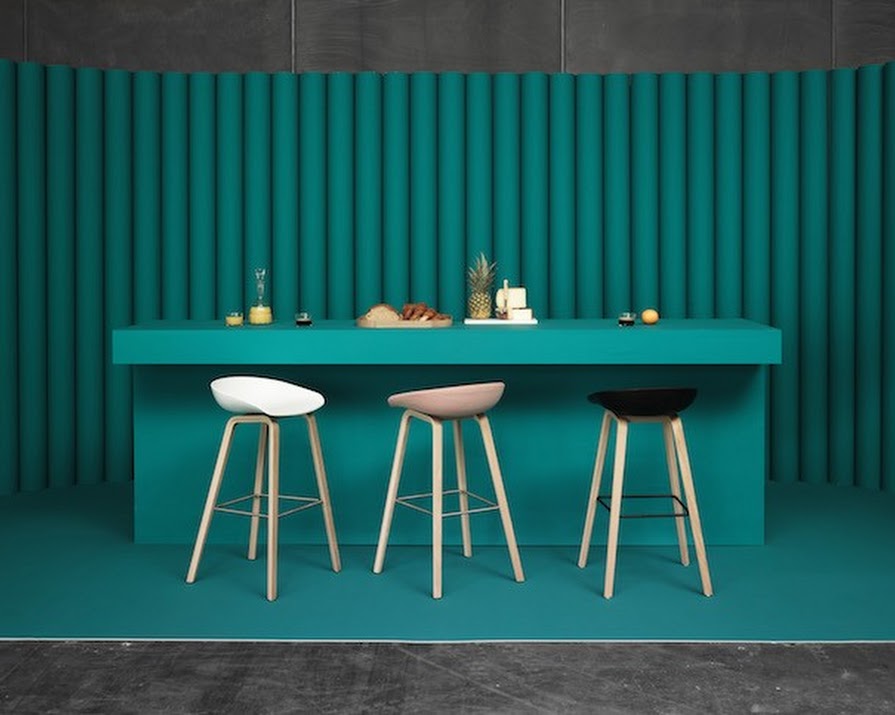
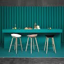
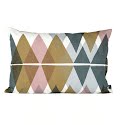
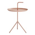
Hay spring/summer 2015 collection.
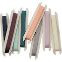
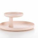
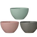
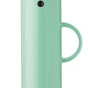
After a soft-hued spring that went heavy on delicate shades of mint, peach and blush, you may?be forgiven for thinking that mild pastels had moved into the realm of the pass??but the truth is, the right contrast can give even the palest of hues new life.
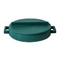
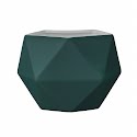
Testing?this hypothesis is the current trend of giving subdued and neutral palettes a dramatic update: a contrasting dash of daring bottle green gives?a sharp, modern interpretation of fresh pastels.
Pitting’soothing pale-peach pinks against rich, brave greens from fern through to forest results in a grown-up look that is more cosmopolitan than candyland. Much-loved lifestyle brand Hay kicked things off with their spring/summer 2015 collection, placing their trademark playful?palette against a bottle-green backdrop. Other brands have swiftly followed suit, presenting’deep woodland tones alongside lighter summery shades.
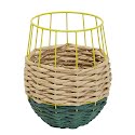
Click through the gallery to get a taste for the new take on pastels. Nervous about going too dark? Try introducing the braver tones in accessories like votives, tiles or flower pots before making any big moves into furniture.
1 | 2?| 3 | 4 | 5 | 6 |?7 | 8 |?9 | 10 |?11 | 12 |?13 | 14 |?15


