


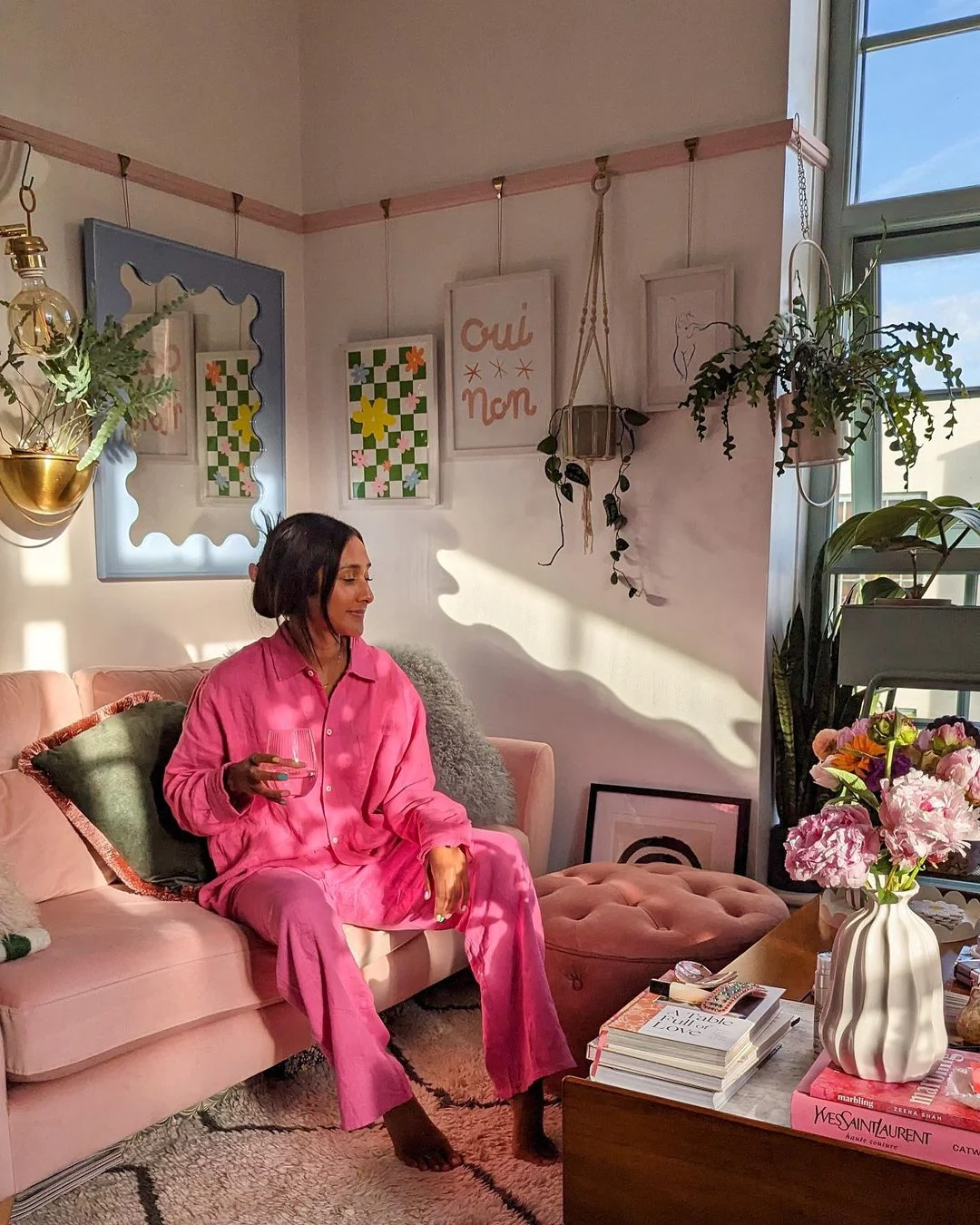
Barbiecore, Pink PP (the distinctive hue Valentino creative director Pierpaolo Piccioli developed for his fall 2022 collection), dopamine dressing; these are but the latest in a long string of buzzwords used to describe our post-pandemic wardrobes.
Muted tones and loungewear still have their place but our zest for life returned with a vengeance once lockdown lifted and our sartorial choices have certainly been reflecting that.
On a global scale, celebrities like Harry Styles (king of the world) have largely governed what we deem fashionable these days. His Love on Tour costume chest comprised a dazzling variety of sequined jumpsuits, chevron pantsuits and chest-baring waistcoats in an array of eye-catching colours – if it wasn’t his fan interaction videos that were going viral, it was his showstopping style moments.
Closer to home, so-called micro-influencers (online personalities with a follower count somewhere within the 10k-100k range) are responsible for shaping our shopping habits. But trends don’t always translate and buying something just because it looks nice on someone else isn’t necessarily a foolproof formula.
“We all have different underlying undertones in our skin… until you understand what they are, you are taking a risk by buying something you’ve seen on someone else. Three-quarters of the colours out there won’t look as flattering on you. When you’re wearing the wrong colours, you have to overcompensate by adding extra makeup because you’re concealing exaggerated or heightened blemishes,” House of Colour image and style consultant Maria Macklin explains.
Intrigued to find out whether I was guilty of wearing the wrong colours for my skin tone, I accepted Maria’s invitation to join her for a personal consultation and made the journey up to her Monaghan studio to learn more.
Collectively, we are definitely wearing more colour, Maria agrees, noting that people have “tuned in to dopamine dressing”. These days, the high street is cloaked in vibrant hues of hot pink, neon green and royal blue – a direct result of Covid, perhaps. “I think people were fed up dressing down when they were working from home, which I know a lot of people still are but they understand the benefit of getting a dopamine hit, feeling more motivated, feeling better about themselves, looking in the mirror and liking what they see. Colour certainly creates that impact.”
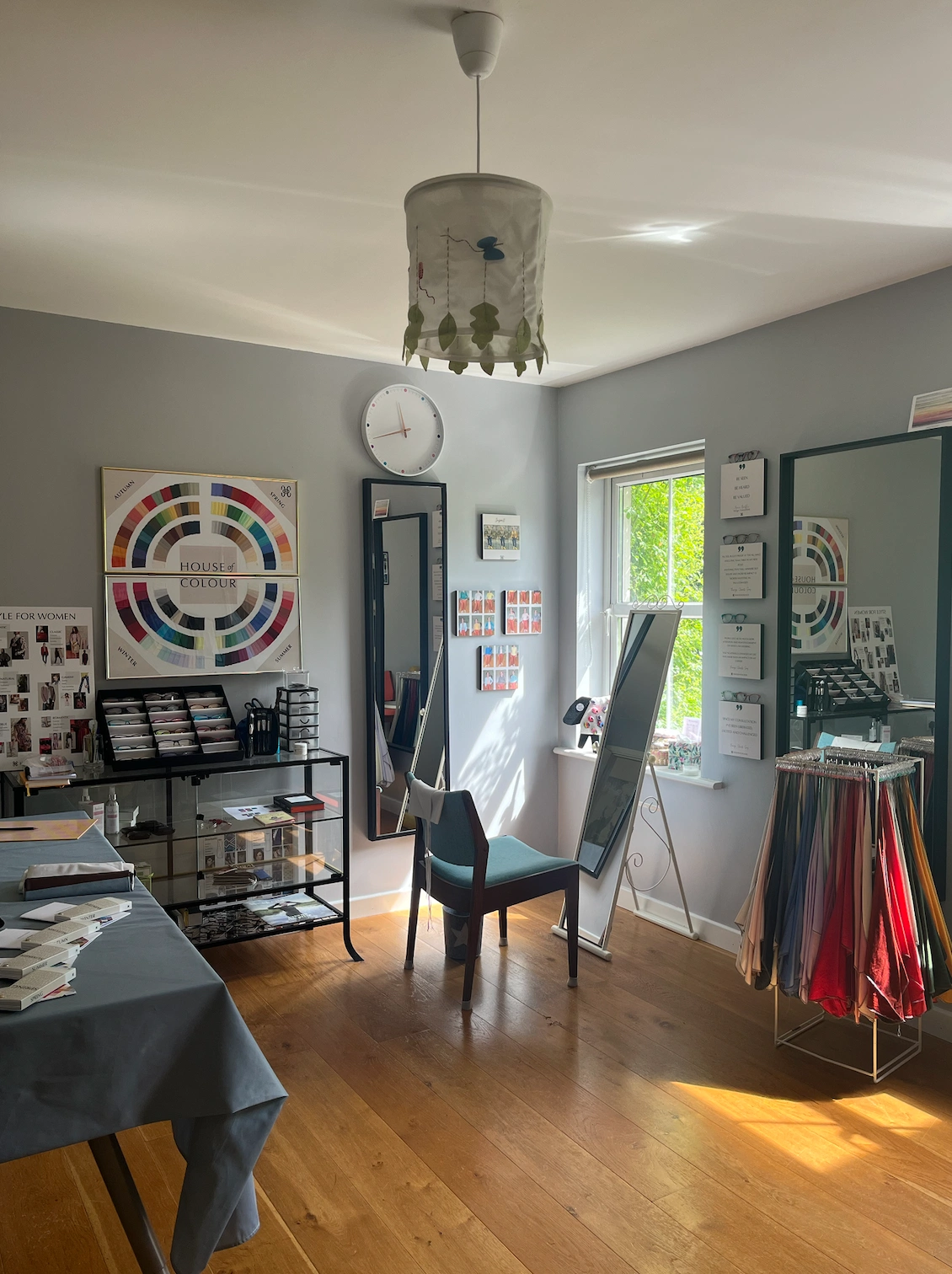
So, how does one determine what their best colours are? Looking at the veins on your wrist won’t help much, unfortunately. Step one: book a colour consultation. The rest is in the hands of the professional (Maria in this case).
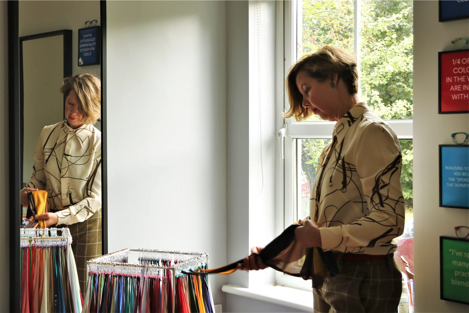
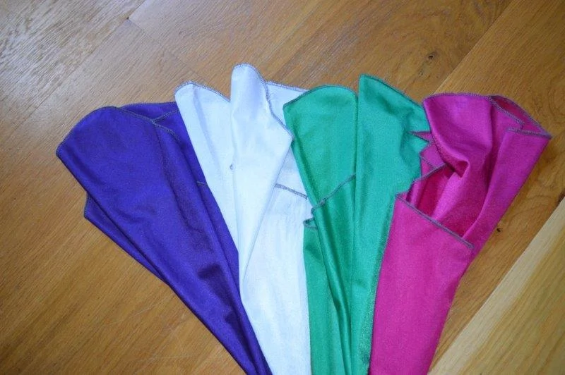
Advised to arrive with no tan or makeup, I happily obliged and once at the studio, I was perched in front of the window, facing a full-length mirror. A white cloak, not dissimilar to the one you wear at the hairdressers, was put around my neck along with a number of brightly coloured bibs, one after the other (this was to determine if my skin had blue or yellow undertones).
With some colours, the difference was obvious, with others it took a couple of comparisons to help me see which one worked better. The colours that suited me made my features pop. My skin, hair and eyes looked brighter and more vivid. The colours that weren’t so flattering completely washed me out – they made me look tired, pallid and kind of grey, honestly.
As Maria puts it, it’s all about “finding harmony”. Sounds a bit woo woo but it actually makes sense. “When you wear colours that match your skin tone and skin undertone you will look fresher, brighter, healthier – you’ll have a glow. You will also look in harmony with your clothes, they won’t take over, they won’t distract and they won’t make all the noise. What we want to see is you first. We want to see your clothes playing second fiddle, what you’re wearing shouldn’t upstage you. So when you have harmony in your colours, that means that you become the focus, rather than your clothes.”
House of Colour use a very science-based approach, dividing complexions into four different categories, each named after a season. Summer and winter are cool while spring and autumn are warm. I’m a “sultry winter” which means that clear, vivid, icy tones suit me best – think fuchsia (right on trend), dark emerald and electric blue. For jewellery and hardware (e.g. belts and other such accessories), silver is my best friend.
In terms of makeup, lipstick with blue undertones is the way to go… this I knew, thanks to plenty of trial and error and some very unfortunate past beauty choices. As an almost translucent Irish person with freckles dotted all over my body like a road map, tan was another area of concern. Avoiding it is Maria’s preference, especially for winters like myself – most brands’ formulae are tinged with yellow (such is the nature of bottled sunshine) which will inevitably wash me out. In lieu of total abstinence, I should look out for colour-correcting options or ones specifically catered to winter skin tones. Xentan, Fake Bake, St Tropez and Isle of Paradise were all mentioned as good options.
Primary red is the most universally-flattering colour as it’s neither warm nor cool and sits right in the middle of the colour wheel. “It’s a wonderful impact colour… it’s the best colour for everybody to wear,” according to Maria. If bright red isn’t your thing, go for navy rather than black (which is too harsh for most people). “Black is not everybody’s best friend, there are lots of other great neutrals out there.”
Within your palette, there are three categories of colours: neutrals, basics and impact colours. Neutrals will form the basis of your wardrobe, they are the colours that will work hardest for you and you’ll wear them time and again. They’re not necessarily statement pieces but they add stability. Basics are next on the pyramid and often come in the form of coats, suits, skirts, tops, belts and shoes. Impact colours are the showstoppers; you wear less of them but they’re only needed in small doses anyway.
Sustainability and versatility are two other strings to the colour theory/analysis bow both of which will save you time and money. Buy according to your palette and everything in your wardrobe will work with everything else. “You can mix and match to your heart’s content,” says Maria. “You will get so much value from your clothes, it’s an incredibly sustainable way of shopping because every item you bring in, you can already make six or seven outfits with.” Not only that, but understanding your colour palette will help you cut through the noise and overwhelm so you know exactly what does and more importantly, what doesn’t suit you.
Naturally, the concept has its critics but the one myth Maria would really like to dispel is that colour analysis is restrictive. “It’s liberating, the choices are vast, the number of colour combinations you can make within your colour palette are endless and the bonus is that the worst you will look is good, every single day.”
Even Coco Chanel once said, “The best colour in the whole world is the one that looks good on you.”
A personal colour consultation with Maria Macklin costs £275 for three hours. You can find out more information here or by emailing maria.macklin@houseofcolour.com. This article was originally published in May 2023.
Feature image via @sophiesinacori
Related Stories


Also Read


